App: TonePad- Tenori-On for the rest of us

Allow me to share with you one of my favorite apps in all of Apple’s App Store: TonePad. You see, I’ve been intrigued by the elusive (and expensive) “visual music composition device” known as Tenori-on since I first heard about it a couple years ago. And since I don’t have the time to make the most of a thousand dollar diversionary investment like the Tenori-on, only an intrigue it has remained.

Which is why I took notice when I first read about TonePad, an app for iPhone/iPod Touch that replicates a part of the Tenori-on concept. And since downloading it, I can’t stop making minimalistic, dreamy tunes with it.

Usage is straightforward and simple. On launching the app, the user is presented with a 16 x 16 grid of dots, where the rows represent the beats and the columns represent 16 tones, with higher pitches at the top of the grid. Press a dot to activate that particular note and each time the measure loops to that beat, a tone is played. For visual feedback, each dot pulses as it is played. Combine dots into chords and melodies, and voila, you’re making music.

The tones themselves are pleasant, with a small reverb applied, making it hard to create a “bad” song. Sure, swiping a finger across the interface may not make for the most compelling of compositions, but it certainly doesn’t create the mess that mashing a keyboard or piano does.

As fun as TonePad is though, it does suffer from some limitations. For one, the composition options are fixed. The tempo, time signature and tone are set to a default, and on a default they must stay. You can’t make the loop any faster or slower, or change the number of beats in the measure or change the basic sound of the tone (or make it another sound entirely). Also, you’re limited to working within just the one loop. It would be pretty nice to be able to set up a loop and have it continue to play as you put together another loop to layer on top (and it would be especially nice to do it with different base tones). Finally, and this one can’t really be helped, but the dots are small enough that they can be troublesome to accurately press. There have been a number of times when I wanted to turn one off and ended up turning the neighbors on.

But hey, I’m not really complaining. TonePad is both fun and free and a worthy app to carry in one’s pocket.

Enjoy some TonePad improvisation from yours truly:


On the Web: tonepadapp.com

iPod: Sort Your Albums by Year of Release

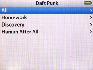
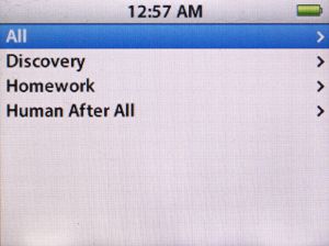
daft punk sorted by album title
The iPod’s default behavior is to sort alphabetically.
Here’s Daft Punk’s albums:
Discovery (2001), Homework (1997) and Human After All (2005).

Not that long ago, I was asked by a commenter if I had any suggestions for getting the iPod to sort albums chronologically. By default, the iPod’s behavior is to sort albums alphabetically by title. In iTunes, there’s the option to sort “Album By Year” but the iPod features no such function.

At the time, I didn’t have much of an answer for him other than to put the albums in a playlist and just listen to the songs in chronological order. But in an interesting twist, the pixels in that reply were barely dry before Apple released version 1.3 of the firmware for 5G iPods. After some further discussion, this trick was discovered:

The most noticeable change in firmware 1.3 is the application of iTunes’ “smart sorting” (ignoring “a” “an” and “the”), including recognition of iTunes’ custom “Sort Fields” (Sort Album, Sort Composer), for Album and Composer. The Sort fields allow you to enter any text that you want and iTunes/iPod will use that to order the list of items, while displaying the text from the actual field.

Using the Sort Album field, you can easily put albums in whatever order you like. For example, you could put the Halo number of Nine Inch Nails releases in the Sort Album field to have all items, including singles and remix albums, displayed in the order they were released.

For basic chronological sorting, just put the year in the Sort Album field and voila, the iPod will show the album title, but they will be ordered by the year.

UPDATE: The previous version of this post recommended putting the year of the album in the Sort Album field. This, however, effectively changes the name of the album within iTunes’ logic, making it group all albums of the same year together.

The revised method is to simply prepend the year to the album name in the Sort Album field. This way, each album gets a unique identifier that still sorts by year.

Additional caveat: this tip has the potential (there have been mixed reports) to reorder the listings of the “Album” browser, as the Sort Album field may be applied to it. So if you ever use the iPod’s Album View, keep this in mind. See the discussion in the comments for effects and solutions.

For this demonstration, I’ve selected Daft Punk’s three studio albums:

  • Homework (1997)
  • Discovery (2001)
  • Human After All (2005)

As you can see in the image at top, the default behavior is to display the albums in alphabetical order, with Discovery as the first. How do we fix that?

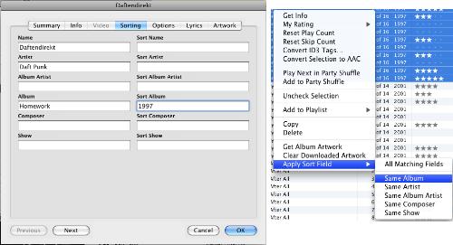
add a year to Sort Album to sort by release date
click to enlarge

  1. In iTunes, get info on the first song of the album.
  2. Click the Sorting tab.
  3. Enter the year of the album then the album name into Sort Album field
  4. Click OK.
  5. Select all the songs on the album
  6. Right-click/Control-click and select Apply Sort Field > Same Album
  7. Repeat for as many albums as you care to customize

When you next update your iPod, the new data will take effect and the albums will be sorted by release date.

daft punk sorted by year
Daft Punk albums sorted chronologically.

This process works for any 5G iPod that has been updated to firmware version 1.3 (and I assume iPods/iPhones released subsequently) So if you haven’t updated yours, hop to it and then get customizing.

UPDATE 2: As mentioned in the comments, if you have an artist who released two or more albums in the same year, there are two options you can use to sort them appropriately:

  1. If you know the more specific album release date, you can prepend that to the album name.
    Example: If one album was released in March and another in October, use 2008-03 and 2008-10 .
  2. If you don’t know the date, you can order them with a number.
    Ex: 2008-1 , 2008-2 and so on.

5G iPod Problems with Audiobooks, revisited

Lately I’ve been on a tear with audiobooks, managing to cram a number of books in between my regular music and podcast listening. The sudden upswing in interest has prompted me to renew my investigation of the problems the 5G (fifth generation) model iPod has with long-playing books. As I noted last summer, the 5G has troubles with homemade m4b files (bookmarkable AAC) longer than a certain play time.

The iPod will suddenly stop playing an audiobook within a few minutes and return to the main menu. This happens when resuming a book, after having listened to something else or resyncing the device, basically anything that stops rather than pauses the book. When selecting the book again, the iPod starts from the beginning, having lost the bookmark and updating the play count/date as though it had properly finished playing.

Since I knew I would be delving into book territory, I decided to figure out the optimum way of working around the iPod’s inexplicable limitation. And really, for all my experimentation, the only concrete result I’ve been able to find is: 4 hours. 4 hours is about the maximum running time of any homemade m4b audiobook file before the iPod starts wigging out about it. It didn’t matter what I used for my encoding settings, my sample rates, or bit rates or channels or workflow or program. No combination of settings allowed the iPod to play longer than 4 hours without a hiccup, always stopping in the middle of the same phrase.

I even tried this little ingenious trick:

audiobook start time option

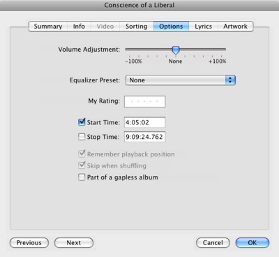
I manually set the audiobook’s options in iTunes so that the start time was at the 4 hour mark, hoping to persuade my iPod to at least go for another 4 hours. No dice.

I can say however that the sample rate seems to have the most effect on how long you can listen before the iPod won’t let you pick up where you left off. 22 kHz seems to be the trick. Whether your book is stereo or mono seems to matter little, giving about the same performance. Same for bitrate. However, higher sampling rates seems to reduce the amount of time before you lose the bookmark feature.

There probably are a handful more combinations and techniques I could try, but it takes quite a while to join, encode, test and evaluate each option. If anyone finds something with significantly different results, feel free to drop a line this way.

audiobook builder max part length

In the meantime, I’m glad Audiobook Builder can set a Maximum Part length and will split files so that nothing is longer than what I need them to be. It’s a groovy little workaround.

Thoughts on an iPod Shuffle

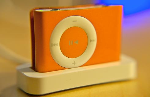
Orange iPod Shuffle in Dock (photo by tunequest)
Thinking of an iPod Shuffle? Find one on Amazon.

Birthday season is in effect around the tunequest compound and themodernista kicked off the festivities by presenting me with my long-desired orange iPod Shuffle (2G) (which I have dubbed “Shuffleupagus”). I had been struck by the orange model since they were announced this past January, but despite its relative inexpensiveness, I could never justify purchasing one; I’m a fairly austere guy when it comes to material goods and all my iPod needs have been handled quite nicely by my 5G. Still, the gift is not unappreciated, though I am somewhat abashed to admit that it makes the seventh iPod in six years for a family of two.

After palling around with the device for couple days, I’ve made some observations. Overall, the iPod Shuffle is pretty sweet and the vibrant orange casing is quite the eye-catcher. Straightforward and easy to use, it provides no-thinking audio entertainment. I love my 5G-pod, but its daily use often involves effort, whether its assessing new music, adding star ratings, absorbing dense material such as audiobooks and podcasts or just plain searching for something I’m in the mood to hear. The Shuffle, with a suitable playlist, provides a worry-free, effortless and enjoyable experience and the one gigabyte capacity provides ample music for daily jaunts, commutes and errands.

That experience, however, does come with some caveats.

The iPod Shuffle’s biggest strength is also its biggest weakness: the lack of a screen. The same brain-dead simplicity that allows for simple recreation also can be a hindrance in some situations. On my 5G, whenever I run into a track that might be corrupted or otherwise malformed, I mark it with two stars as a way to pull it out of rotation and set it aside for reevaluation at a later date. On the Shuffle, that’s just not possible. And of course, when I can’t quite place the name/artist/album of the song I’m listening to, I’m just out of luck trying to identify it.

Also, the unit provides no visual indicator for volume. It’s hard to know exactly how loud the Shuffle is set without any visual feedback. I had it plugged into the tape adapter in my car and nearly blew out the speakers when a quiet classical piece transitioned to some bombastic Primus bass. Gave me quite the jolt too. In iTunes, however, you can set a maximum volume with a volume limiting slider.

Also, there’s no internal clock. The vast majority of my listening habits rely on the heavy use of iTunes’ Last Played Date. As a condition on my Smart Playlists, I use it to automatically refresh my listening selections, rotating recently played songs for those that haven’t been played in a while. The first-generation Shuffle was noted for its lack of a clock and, unfortunately, its successor is no different. Without a clock, the Shuffle has no way to know when you’ve finished playing a song and thus can’t update iTunes the next time you sync up. Instead, iTunes sets the Last Played Date to the time at which you perform the sync. While not quite as precise as I’d prefer, I tend to update my Pods frequently enough that it shouldn’t disrupt my schemes significantly.

Then there’s the size again. The thing is wicked small and keeping track of its whereabouts has proven bit elusive. A couple times already, I thought I had misplaced it or lost it under some paperwork when it was actually still clipped to my pocket. That’s definitely a behavioral change that I’ll have to adjust to.

Despite these minor inconveniences, and that’s really what they are, inconveniences, the iPod Shuffle is a solid product. In the few days I’ve had it, I’ve already found myself reaching for it more often than my 5G when I want to sit back and relax. In fact, once I get going, I find myself hesitant to turn it off. The only thing I need to figure out now is how to shuffle-by-album (if that’s even possible) rather than default shuffle-by-song.

Managing a Two iPod workflow is just too difficult

(or, Initial Thoughts on the iPod Touch)

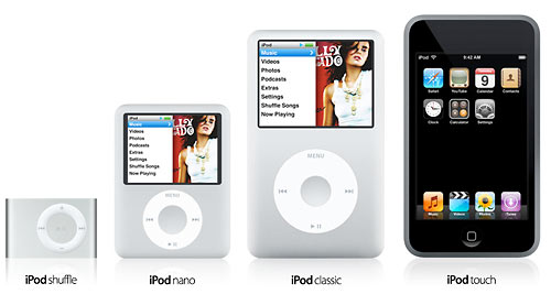
iPods shuffle nano video classic and touch

Weeeee… new toys from Apple! iPods iPods iPods, including shuffles in drab new colors (gimme orange), a new iPod NanoVideo (aka iPod Squat), an all-metal iPod Classic (the form we all know and love––now up to 160GB!) and a phoneless iPhone (aka iPod Touch).

Upon the availing of the line up this afternoon, I was immediately torn. In my mind, the iPod brand is essentially “a bajillion songs in your freakin’ pocket––more songs than you could ever practically listen to but who cares because it’s a bajillion songs! In your pocket!!” and the upgraded 160GB model is encoding a lot of digital saliva in tunequestland. The iPod has finally caught up to the point where I could realize the dream of fitting my entire library (all bajillion songs of it) onto a single portable device and that sounds like a lot of fun.

But Apple had to go ahead and simultaneously release that little portable wi-fi web browsing internet communication device, didn’t they? More than anything since the iPhone was announced in January, the prospect of in-your-pocket internet has been very appealing. But of course, I already have a phone that does everything I need a phone to do, so I wasn’t (and still am not) about to plunk down for the device. At the time I thought that if Apple wanted to unbundle the phone from the package, great, I’d look at it then.

And Apple has done just that with the iPod Touch and that is the source of my quandary.

The storage capacity of the iPod Touch’s models is 8GB and 16GB, a major step down from what I’m used to. While I did fine for years with a 15GB model, I’ve gotten accustomed to lugging around roughly 40-50 gigs of music, podcasts, audiobooks, courses from iTunes U, videos, photos and data at any given time. The thought of having to cram all that back to 16GB or gasp!, 8GB, is anathema to my idea of what an iPod is.

Then a thought occurred to me…

I’m still quite happy with my 80GB 5.5G model. I’ve had it for almost a year and the only major disappointment I have with it is my recently discovered long audiobook problem. I’ve been especially surprised by the durability of its screen. It’s not had any kind of protector and there’s nary a sign of a scratch or mark. While the idea of a 160GB iPod Classic is a very compelling dream, I’m more than happy to continue using my existing hardware as my workhorse iPod.

But… what if I were to simply use an iPod Touch almost exclusively as an internet device, saving most of the traditional iPod functions for my 80GB? That would be the ticket.

And for a moment, with the Reality Distortion Field set to maximum capacity, I seriously considered that option. Then I quickly came to my senses. I’ve tried managing multiple iPods for different purposes and it’s just too much effort. For a while, I tried to divvy up music and spoken audio (podcasts, books, etc) between two devices and invariably, I’d find that I didn’t have the one I wanted at the moment I wanted it. Then there was the hassle of keeping them both synced, updated and charged. Before too long, I abandoned that idea. Besides, when one device can do most or all of what you want it to, there’s really not much point to segregating the duties.

And the more I think about it, the less certain I become that I’d actually find a significant use for an iPod Touch. My multimedia needs are already handled by my 80GB and the vast majority of my wi-fi usage is done in my house, where there are four computers I have access to. Furthermore, based on the images at apple.com, I don’t see icons for some of the traditional “Extras” provided on the iPod’s interface, like Games and Notes (though I wouldn’t imagine that they’ve actual been removed). And where’s the note taking program to make use of that famous multi-touch interface? Other than for novelty, I can’t really see myself getting one, that is, until the storage is increased. Though that might change if it turns out the the Touch has inherited the iPhone’s PDF-reading capabilities. I’ve been wanting to make those portable documents truly portable.

But for now, the bottom line: I’m happy with what I got.

Of course, for me, this all a moot discussion unless iTunes 7.4 fixes 7.3’s horrible sorting problems, which, at first glance it doesn’t.

::

PS- Did anyone else notice that Music and iTunes are separate selectors on the Touch? I realize that using the term “iTunes” is Apple’s way of differentiating pre-loaded music from on-the-go purchasing, but it strikes me that that this could be a subtle shift in the iTunes branding away from the “your personal jukebox” function and toward the store aspects. If you look at Apple’s various iTunes pages, you’ll see that the money-making features are more prominently displayed.

iTunes 7.3 Sorting Problems: Fallout Central

Part of the iTunes Sorting Debacle Series

  1. iTunes 7.4.2: No Change in Sorting behavior
  2. iTunes 7.3 Sorting Problems: Fallout Central
  3. iTunes’ totally effed up sorting

Apple has really screwed up with the new sorting behaviors introduced in iTunes 7.3 and it’s making a lot of people seriously unhappy. And, honestly, I’ve NEVER been mad at Apple for anything in my 25+ years of history with the company (annoyed at times, but never mad), but the more I think about this the more pissed I get. For those just joining the story, Apple released version 7.3 to accompany the launch of the iPhone. Included in that release was a new, completely arbitrary rule set for sorting Artist, Album, Composer, Genre, etc tags.

Quoting myself:

Starting with version 7.3, numbers and other non-alphabetic characters are sorted to the bottom of the list. My default view now shows Aalborg Symphony Orchestra at the top. 2pac now begins after the Zs and iTunes suddenly doesn’t even know how to handle artists whose names begin with punctuation. It starts !!! after songs that don’t have anything entered into their Artist or Album tags!

*snip*

iTunes now ignores the non-alphabetic leading characters and sorts based on the first letter or number it finds in the name. The program now treats fields that are all punctuation as if they are blank, as if they have nothing typed in at all. And guess what else? It passes that behavior to the iPod.

At first, it seemed that the issue was a bug, but as revisions came out, it became clear that this new behavior was intentional. Indeed, an Apple support document created July 11, 2007, explains the new scheme as if everything is hunky-dory. The odd thing about this is that there is no rational explanation for it. Before 7.3, iTunes used case-insensitive ACSII as its basis. It’s a decades old standard that all electronic devices use.

Symbols > Numbers > Letters. That’s the order the entire Western world has been using for all of modern memory. Look on any computer’s desktop and that’s how you’ll see files arranged. Hell, even the 131-years-old Dewey Decimal System sorts numbers before letters. Perhaps more bizarrely though, is that this behavior only appears to affect the first character in the music tags. Playlists and second character sorting (unless the whole field is made of punctuation) still seem to use the ASCII method. Say whaa? If you’re going to screw up a standard, you might as well be consistent with your screwery.

Seriously, this abrupt abandoning of established convention brings Apple closer to Microsoft’s behavior regarding standards. Could you imagine if, on a whim, Apple suddenly changed the way Safari renders web pages to its own specifications, rather than W3C standards, perhaps in order to accommodate the iPhone? That’s how bad this is.

So far, the suggested workaround is to use the Apply Sort Field command to manually restore normal sorting, a process that is cumbersome, tedious, counter-intuitive and shouldn’t even be necessary. In my case, I’d have to apply it to 150-200 albums and gobs of composers and I’m not about to waste my time doing so. Alternately, you can downgrade to iTunes 7.2.

I am not alone in my ire. Others in the passionate-about-iTunes community are equally upset at this development. Here’s some choice reactions from several threads around the net.

Code Monkey at iLounge forums:

It’s not just a “strange” decision, but a downright moronic one. First off, anybody bright enough to use a computer knows that symbols and numbers sort before alphabetical characters. Second off, what was the whole point of introducing the ability to customize sorting in 7.2 if they were just going to turn around and bork it with 7.3?

GadgetGuru72 on the Apple Discussion boards:

Thanks. I am familiar with all the suggested workarounds.

However, I shouldn’t have to use a “workaround” to get a “1” or a “?” to sort before the letter “a” any more than I should have to use a “workaround” to get the letter “a” to sort before the letter “b.”

Amen to that.

Andrew Wiggins in the comments to another iLounge article:

I’m extremely irritated that the numbers vs. letters order has changed. This has messed up with my established order for albums that I was very pleased with.

Comment at engadget: (sic)

WHAT ON EARTH, HOW ANNOYING

they have changed the Digit order, when you sort column be accending, so all those people who had there music sorted by Artist with bands like +44, 65 Days of Static and 30 seconds to Mars ect… will now find that in that mode they are liseted at the bottom after your XY and Z’s (if you have any) Thats just annoying, why the change?

The rampaging horde at Digg:

The sorting in iTunes 7.3 is totaly screwed. Apparently numbers now come after letters.

This was by far the most annoying thing in the update. Brackets and parentheses are ignored in sorting, too!

WTF are they thinking?

well, I did notice that the sorting on the iPod is the same way. Numbers come after letters.

In any case, stupid.

The numbers after letters thing is what really gets me. It’s completely f’ed my entire library.

Comment at Neowin forums:

I really dislike what they did to the artist ordering. That alone makes me want to downgrade

Comment at MacRumors forums:

The 7.3 update is what caused the error in sorting (numbers and symbols after z.) I was hoping the 7.3.1 update would fix it, but it sounds like it doesn’t.

Quote:
Originally Posted by ryry919 View Post
not sure if anyone else has noticed this, but when I opened iTunes back up after the update I noticed that all of my artists that are a # (IE: 311, 3 Doors Down) are all now at the end of the iTunes artist sort rather than being at the top, before the A’s like it used to be.

anyone know of a way to change this back? is there anything like how you can either view you contacts in address book for first, last or last, first? just wondering.

I downgraded my iTunes to 7.2 for the time being.

Someone’s LiveJournal

Dear $deity why? Why would they do that?

Everybody knows its punctuation->[0-9]->[Aa-Zz], anything else is heresy!

And so on. I’ll add more as I run across them.

For now, the only way to get “standards compliant” sorting back is to downgrade to iTunes 7.2. I’ve done this already and until I see a version that restores standard procedure (or at the very least offers the option of using either scheme), I will not be upgrading to any future version of the software. That basically means I’ll never buy an iPhone or any other product that requires a subsequent version of iTunes. I’ll probably save myself some money that way. If you don’t have an iPhone, I suggest that you do the same. Download for Mac. Download for Windows.

In the meantime, though Apple’s traditionally not very responsive to customer feature complaints, it never hurts to try: http://www.apple.com/feedback/itunesapp.html
iTunes’ totally effed up sorting

Part of the iTunes Sorting Debacle Series

  1. iTunes 7.4.2: No Change in Sorting behavior
  2. iTunes 7.3 Sorting Problems: Fallout Central
  3. iTunes’ totally effed up sorting

…and managed to sully my iPod too. And the more I think about it, the more pissed off I get. What Apple has done defies all standard convention, is completely arbitrary and makes ab-so-lute-ly zero sense whatsoever.

Allow me to go on.

I had put off updating my iTunes to 7.3.2 until a couple days ago. With all the time and energy I invest into pruning and perfecting my library (it’s like bonsai really), I usually give the early adopters in the Mac community enough time to warn me of any critical errors or whether the new update is going to irreparably damage or otherwise soil my files. It’s just common sense.

So, having read no reports of exploding iPods or iTunes-induced electrocutions, I figured it was time for the latest and greatest. At the very least, I could get the app to stop bugging me about the update every time I launched it.

The update process went smoothly enough, like a Dove chocolate bar, and I was quickly back to makin’ playlists and retrieving album art. It took me about a day, however, to realize something was… awry.

The default view of the Music tab had changed. As a matter of course, I keep it set to Album by Year, which in effect sorts by artist then sub-sorts the albums by the year they were released. Before the latest update, that meant that the band !!! was listed first, followed by +/- then into the numbers. It was logical: standard convention dictates that that’s the way alphanumerical sorting is done in English.

Far be it for Apple to let any convention go unchallenged…


neatly organized ipod composers
Neatly organized iPod composers.

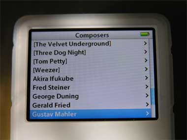
scrambled ipod composers
A scrambled mess.

Starting with version 7.3, numbers and other non-alphabetic characters are sorted to the bottom of the list. My default view now shows Aalborg Symphony Orchestra at the top. 2pac now begins after the Zs and iTunes suddenly doesn’t even know how to handle artists whose names begin with punctuation. It starts !!! after songs that don’t have anything entered into their Artist or Album tags!

On one hand though, I do have to give iTunes some credit. When sorting numbers, the program is smart enough to know that, numerically, 101 Strings comes after 50 Cent.

I’m not averse to change in general, and though somewhat inconvenient, these new sorting behaviors aren’t a fundamental flaw. I can deal with it. Update 8/28: I take that back. This IS a fundamental flaw and it needs to be fixed. There’s no excusing it. However, the real travesty here is how iTunes now treats the Composer tag. In this case, it looks like Apple specifically set out to destroy my Composer tag scheme, the one where cover songs have the original artist surrounded by [brackets]. The purpose of that is to separate cover tunes from actual composers when browsing Composers on the iPod.

Well, guess what? iTunes now ignores the non-alphabetic leading characters and sorts based on the first letter or number it finds in the name. And guess what else? The program now treats fields that are all punctuation as if they are blank, as if they don’t have any characters at all. It passes that behavior to the iPod. Now when browsing by Composers, the list I’m presented with is a jumbled mess. I’ve got [Fleetwood Mac] sittin’ next to Edvard Greig and [Ted Nugent] holding hands with Tchaikovsky, which is the exact situation I was trying to avoid in the first place!

And that’s not even mentioning my workaround for remix albums, where I list the song’s originator in (parentheses).

So, thanks Apple for fixing something that wasn’t broken.