Cumulative lifetime play counts

A rambling, self-indulgent, inconsequential post about habits, statistics, speculations, accumulation and missing data.

::

I can’t help but be disappointed that I can’t see lifetime stats for my music listening habits. In these days of play count-tracking programs like iTunes and websites like Last.fm, it’s easy to get caught up in the musical trends of your life. It’s especially interesting when you look at the numbers and discover that you perhaps don’t like a certain style of music as much as you thought you did or you find that you listen to a particular band much more than you would have guessed.

The problem is that your revelations are only going to be as good as the data you’ve collected. I’ve been a “serious music listener” for about 16 years, yet Last.fm has only been tracking my habits for three and my iTunes library only goes back six. I have ten years worth of listening that I will never have any way to quantify simply because the data was never collected.

Missing data, of course, skews results and in this case, snapshots of my habits are skewed in favor of recent years, especially when looking a cumulative lifetime stats. Using data from my library as it stands today, I put together a graph of my most popular years in music. I’ve been for the most part, a contemporary music listener, so the vast majority of my library contains music released from 1993-2008, adding new releases each year.

I calculated the total number of play counts received by all songs in my library that were released in a given year. Here’s the result:
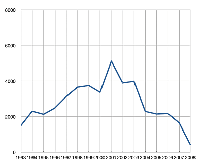
itunes play counts by year

This graph shows the distribution of all my play counts generated since July of 2002 (when iTunes began recording them). We see a peak in 2001 and a general downward slope since.

My explanation for the shape of the graph is that, as years come and go and a music library grows, newer music receives more attention than older music. Familiar tunes give way to new acquisitions and explorations. However, those old tunes never entirely go away; they continue to co-exist with the new ones. As the years pile up, each one’s presence is diluted among the rest and it becomes and increasingly uphill struggle to for the songs of a new year to reach parity with those of the past.

So in this particular graph, I attribute the 2001 peak to the simple coincidence that the songs from 2001-early 2003 were in high rotation at the time that iTunes started tracking play stats. As a result, the initial rate of change for those songs was quite high. And even though the rate at which those songs get played has decreased (exponentially) over time, the songs from other years still have to compete with them for attention, so we find a general trend decreasing cumulative play counts.
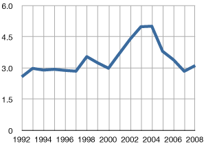
average play count by year
Average Play Count by Year

Further evidence of this idea can be seen in the average play count for the songs of each year. There’s a bump in the 2003-2004 area, reflecting the idea that older songs tend to accumulate more play counts over time.

I can’t help but wonder what that play count graph would look like if iTunes had been released in the early 1990s? How much cumulative lifetime play would we see throughout the years?

Of course, there’s no way to figure that out. That information is trapped in the fog of memory, stored in transitory listenings of cassette and compact disc. But while that individual play counts may be lost forever, it might not be impossible to make a decent educated cumulative guess.

I’ll start with the premise that from the years 1993-2001, I averaged a mere 10 songs per day between school bus rides, studying, hanging out, commuting and partying from early high school, through college and my entry into the workforce. That’s probably a conservative estimate, considering the general lengths of my bus rides and commutes. Heck, I’ve managed to generate nearly as many plays in the past 6 months, and I’ve lately been slacking on my music listening in favor of podcasts and audiobooks. But 10 is a good number, so I’ll stick with it.

So, at 10 songs per day, that’s 3650 plays per year. Consider the state of my collection in those early years. Throughout high school and into college, I managed to add records to my library at an average rate of one per week. If iTunes had been around at the time, play counts by now would be heavily concentrated in those early additions, with the highest concentrations being in the earliest records I bought.

By the end of the first year, my estimated 3650 plays would be spread among a mere 500ish songs, an average of 7.3 per songs. By the end of the next year, another 3650 plays would be spread out among about 1000 songs, 3.6 per song. Except that I expect that drop off in older songs to be exponential, not linear.

After some more conjecture and guess work, I extrapolated the accumulation of play counts over the years. After some number-crunching, I had a graph that looks like this:
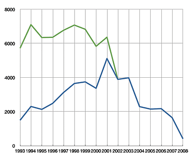
cumulative play counts by year adjusted

The blue line is the same as above, showing the cumulative distribution of play counts by year of release in my iTunes library. The green line represents what the graph would look like if my estimated historical plays were added to the existing totals.

What does this totally unscientific, made up graph tell me? Basically what I already suspected: that I’d have to stop listening to my older tunes altogether and for a long time if I ever wanted current tunes to “catch up.” Of course, in the time it would take to do that, future tunes would be at a deficit. So really, while it’s a somewhat nice visualization, in reality it will have no bearing on my future plans.
Standard Deviation of the Years in my iTunes Library

I spent part of the past weekend doing some basic statistical analysis of my iTunes Library. I’ve been collecting music for 16ish years now, so I decided to see what kind of historical trends I could find.

One task I assigned myself was to look at the variety of the time span of the releases in my collection. Now I don’t have to do any fancy calculations to tell you that the vast majority of the songs in my library date to the same 16 year period that I’ve been collecting for. Indeed, if you line up all the songs in my library in chronological order by release date, the Median year is 1998. That is to say that half the music in my library was released before or during 1998 and the other half was released during or after that year.

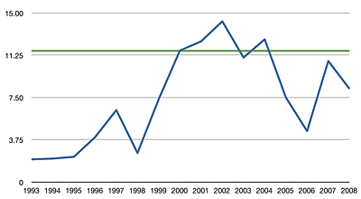
The next step I took was to look at the variety of the release years for each calendar year that I’ve been collecting. I did that by segmenting my library by each year since 1993 using iTunes’ Date Added field, then calculating the standard deviation of the Year field for every song on that list. The lower the result, the more “consistent” that year’s additions were. The higher the number, the greater the eclecticism in that year’s acquisitions.

The results are plotted in this graph:

The green line is the standard deviation for my library as a whole.

In the 90s, I was pretty much an “alternative rock” junkie, so the span of years is pretty narrow overall. But see the bump from 2000-2002? That was late college and my hipster days, when I really had all the time in the world to haunt record shops, variety stores and Usenet groups in attempts to explore the most obscure nonsense. I mean, Morton Subotnik and film scores to Godzilla movies. That kind of nonsense.

It’s cool though, I also discovered Can and Neu! during that same time.

Impact report update

My original High Impact formula had a fundamental flaw, which I think I may have fixed.

I spent the last post talking about the albums that made the biggest “impact” on me during 2007, but what exactly does that mean? Over the summer, I came up with the general concept, which basically defined impact as the average number of times any particular song from an album or artist in my iTunes library had been played, showing who has received the most attention relative to their presence in my library. Add together the play counts of all songs by an artist or on an album, then divide by the number of songs. There’s the impact score.

While this method produced some interesting results, it suffers from a substantial deficiency: it grossly inflates the relative impact of artists and albums that have a low number of songs. Artists or albums with a lot of songs have to be played a lot more in order to keep up. I noted this in my original post on the subject:

In cases where an artist has a low number of songs, each play count is “worth more” in relation to other artists. A single play by an artist with only one song nets that artist a full “point,” whereas as single play by an artist with 20 songs would only gain .05 points.

The solution I devised at the time was to set a threshold for inclusion, eg. artists must have more than 5 songs in my library to be ranked.

I never really liked that workaround because the threshold was arbitrary and it excluded artists who should really have been able to be ranked. So I spent a bit time recently tweaking the formula and I think found something that works to my satisfaction:

Total Play Counts [squared] divided by the number of songs.

This is essentially the same as the original formula, except that the total play counts an artist or album has received is multiplied by itself. The effect of this is to give the impact of a single play more weight as the number of songs increases. My thinking goes like this: albums with a lot of songs should rightly have a larger impact vs those which have fewer, even when the average play count is the same.

Suppose we have an album with 10 songs on it and an EP that has 4. Each song on both albums has been played twice.

Using the original formula:

Album: total play count (10 * 2) / number of songs (10) = 2
EP: total play count (4 * 2) / number of songs (4) = 2

Eight (8) plays gives the EP the same impact as the album that has received twenty (20).

Now the new formula:

Album: total play count squared (10 * 2)(10 * 2) / 10 = 40
EP: total play count squared (4 * 2)(4 * 2) / 4 = 16

Even though both recordings have been listened to the same number of times, the album’s larger footprint leaves a greater impact score than the EP.

The best analogy I can think of is mass vs speed. More songs equal greater “mass.” More plays equal greater “speed.” Just as lighter objects have to travel faster to hit with the same amount of force as heavier objects, an artist with a lighter presence in my library has to be played more times to have the same impact as an artist with a lot songs. A ping pong ball must travel at higher speeds to equal the same force as a baseball.

This table below shows the formula in action.

Rank Artist # of Songs Plays AVG Impact
61 The Cardigans 92 255 2.77 706.794
62 To Rococo Rot 34 155 4.56 706.618
63 Tomoyasu Hotei 1 26 26 676.00
64 Molotov vs Dub Pistols 1 26 26 676.00
65 National Skyline 17 107 6.29 673.47

The two singles by Tomoyasu Hotei and Molotov vs Dub Pistols happen to be in the top 20 most played songs in my library (out of ~16000). That showing places each of them relatively high on the list, but not overwhelmingly so, considering the differences between the various AVG play counts. That’s an equitable result I’m pretty happy with.

iTunes Report: High Impact Artists

I’ve spent the past couple days playing around with Alex King’s iTunes Stats program. It’s written in PHP/MYSQL and requires a web server to run. With the MAMP one-click server running on my PowerBook, I had little trouble installing the program (though I did have to substantially increase the PHP timeout setting so it could handle my large library).

iTunes Stats reads XML files, one can load an entire iTunes library or export playlists for more selective examinations.

The program also comes with a number of built-in reports, such as Most Played Albums, Most Played Artists. Top Rated Albums/Artists and the option to weight by number of rated songs and play counts. The engine supports adding custom reports, so if you are motivated enough, you can create new methods of analyzing your music.

My PHPMYSQL-fu is not very strong virtually non-existent. Still, I was able to cobble together my own metric: Artist Impact.

An Artist’s Impact is measured by the total number of play counts they have received divided by the number of songs that artist has in the library. For example, Artist A has 20 songs in the library and those 20 songs have been played a total of 100 times. Thus, 100/20 = 5. That’s Artist A’s Impact. Basically, it tells you, the avergage number of times a song by that artist has been played.

This formula is a way to compensate for the bias present when some artists have significantly more tracks than others. In my case, I have 329 songs by film composer Jerry Goldsmith. He has an inherent advantage over say, The Breeders, who have 63 songs in my library. By virtue of being so prolific, Jerry is naturally going to have more play counts.

After playing around with it a bit, I’ve made some interesting observations. Firstly, the top 21 most impactful artists in my library, with one exception, have only one or two songs. In cases where an artist has a low number of songs, each play count is “worth more” in relation to other artists. A single play by an artist with only one song nets that artist a full “point,” whereas as single play by an artist with 20 songs would only gain .05 points.

Fortunately, I’m able to set a threshold for display, keeping outliers from being counted. Here’s my top ten High Impact Artists. The artist must have at least five songs in my library. Additionally, this list only takes into account “popular music” (excludes classical, live shows and film/tv scores).

Artist # of Songs Plays Impact
(avg plays / song)
1 Jet 7 73 10.4286
2 Rilo Kiley 55 512 9.3091
3 Glitter Mini 9 7 65 9.2857
4 National Skyline 10 92 9.2000
5 The Strokes 47 426 9.0638
6 String Theory 5 38 7.6000
7 Mercury Rev 34 257 7.5588
8 mouse on mars 154 1116 7.2468
9 Cex 37 264 7.1351
10 Bran Van 3000 34 228 6.7059

I’m very surprised to see Jet in the number one spot. That’s because my affinity for the band has waned to virtually nil. Still, it’s hard to argue with the dent Are You Gonna Be My Girl? made in my listening habits back in ’03. The ironic part is that overall, I didn’t care for Get Born, so I ended up deleting five of the thirteen songs on the album. Those weaker songs aren’t there to dilute Jet’s Impact by lowering the ratio of play counts to songs, so the band’s number seems artificially inflated.

Overall, I’m having quite the enjoyable time playing with iTunes Stats, even though it’s a little rough around the edges. I’m working on a couple of new reports and have even figured out how to get it to tell me which albums are missing ratings and how many ratings need to be completed.

Fun times ahead!

In search of a definitive album rating formula

When it comes to my iTunes library, I’m a regular statistics nut. Sure, my library exists primarily for my own enjoyment, but it contains so much organically-compiled data about my habits and tastes that I can’t help but want to take a look at it and find out what the data says about my interests.

But for a while now, I’ve struggled to quantify, tabulate and analyze the overall sense of my library. Which of my albums albums are truly the greatest? Which artists, when the sum of their parts are combined, are really my favorites? And by how much? I want numbers.

None of the iTunes stats options available at the moment give me the type of results that I want. The Album Ranking AppleScript provides a simple average that skews toward albums with fewer tracks. SuperAnalyzer provides a top 10 list that is skewed toward albums with more tracks.

Most iTunes stats tools simply provide averages or totals of play counts and/or star ratings. Averages, while somewhat useful, can be misleading. An album could have a handful of awesome songs and a bunch of filler and still rank as well as and album that’s consistently good, but without much breakout material.

And that can be frustrating to me, because, in terms of album or artist worth, I tend to value the ones with consistent performance.

Take, for example, my recent run-down of Air’s discography, specifically the albums 10000 Hz Legend and The Virgin Suicides. After many years of listening, my artistic impression is that Virgin Suicides is ever so slightly the better of the two. The songs on Legend vary from excellent to clunkers. Suicides is overall pretty good, with only one exceptional track. However, averaging my ratings shows that Suicides is a 3.85 while Legend rates as an even 4.

So, to reward albums that don’t veer wildly around the quality wheel, I’ve developed my own album rating formula that takes into account the consistency of all the star ratings on a given album.

The Formula

album rating = (mean of all songs + median of all songs) - standard deviation of the set

The mean sums up the whole of the album. The median shows the state of the album at its core. The standard deviation indicates the variety of the individual ratings. The result is a number on a scale of 1 to 10. (Alternately, divide that number by 2 to return the result to a 5-star scale).

Let’s take a look at the formula in action. Suppose we have two albums with twelve songs each. The first is generally excellent, but varies in quality. The second is good stuff throughout.

Ex. 1 Ex. 2
5 4
4 4
5 4
2 4
4 4
5 4
5 4
2 4
5 4
3 4
5 4
3 4
Mean 4 4
Median 4.5 4
total 8.5 8
STDEV 1.21 0
Score 7.29 8

This table shows the individual star ratings for the two theoretical albums, as well as all the statistical data, as calculated by Excel. As you can see, both albums average score is the same (4) and Ex 1 even has a higher median than Ex 2. But, because the quality of Ex 1’s songs vary a great deal, its standard deviation is substantial, so much so that its album rating becomes 7.29 (or 3.645 on a 5-star scale) when my formula is applied. Ex 2’s score suffers no penalty and its score remains 8 (4). In this case, the standard deviation awarded Ex 2 a bonus for being of uniform quality.

Let’s take a real world example, the two Air albums I mentioned above.

10 kHz Legend Virgin Suicides
4 4
5 4
4 4
5 3
5 3
4 4
3 5
4 4
3 4
3 4
4 4
4
3
Mean 4 3.84
Median 4 4
 
total 8 7.84
 
STDEV 0.77 0.55
 
Score 7.23 7.29

When the formula is applied to my ratings for each, the scores for 10000 Hz Legend and The Virgin Suicides become 7.23 (3.62) and 7.29 (3.65), respectively. So factoring in the standard deviation results in a score that more closely reflect my thoughts of those two albums.

So what does this mean? I’m not sure exactly. In practice, I could whip up some listy goodness and see which albums are truly my favorites. A comprehensive analysis would be cool. I’d love to see the distribution of my album ratings. However, that would require more programming skills than I have. Though that could be a good project to help me learn.

Out of curiosity though, I have picked 10 albums, just to see how they rate. One provision, of course, is that every song on an album must have a rating before the album score can be calculated. These ratings are on a 5-star scale.

AVG My Score
Radiohead – OK Computer 4.5 4.41
Air [french band] – Moon Safari 4.5 4.39
Nirvana – Nevermind 4.5 4.24
Mouse on Mars – Radical Connector 4.33 4.23
Ratatat – Ratatat 4.45 3.97
Nine Inch Nails – With Teeth 4.31 3.77
The Strokes – Is this it? 4.09 3.7
LCD Soundsystem – LCD Soundsystem 4 3.68
Basement Jaxx  –  Remedy 3.73 3.51
Prefuse 73 – One Word Extinguisher 3.82 3.47
Weezer – Make Believe 3.58 3.21

This is by no means a top 10 list, but it is interesting to see where things ended up. It’s also interesting to see how minor fluctuations in star ratings can change the final score. For instance, if that Ratatat album had one more 5 star song in place of a 4 star song, its median number would become 5 and its album score would jump to 4.51. Lower a 5 star to a 4 star and the score only drops slightly to 3.93. I don’t know if this is a flaw in the formula or a reward for albums that have a lot of good songs.

Problems and issues

Small data sets. These are troublesome in all statistical circumstances and this formula is no different. Albums with only one song will, by definition, not have a mean, median or standard deviation, and that kills the formula with a divide-by-zero error. Also, because the formula uses the average rating as a component, albums with a low number of songs will tend to skew one way or the other.

In my library, Boards of Canada’s EP In A Beautiful Place Out In The Country has four fantastic songs and ranks at 4.63, higher than anything on that list above. As a release, I’d say that’s accurate, but I’m sure it doesn’t surpass OK Computer. I would be interested to see a chart of how the album score changes as the number of tracks on an album increases.

Additionally, I haven’t figured out a way to rank partial albums, i.e. albums where I either don’t own all the songs or albums where I’ve deleted songs I didn’t like. For now, I’m just excluding them altogether.

Still, I’m fairly pleased with the results I’ve been getting as I run various albums through the formula. It’s working for me and my own song rating system, but I’m curious to see how it works with someone else’s.

Fortunately, Webomatica has posted his song-by-song ratings for The Beatles’ Sgt. Pepper’s Lonely Hearts Club Band. Using his numbers, the average for the album is 4.38, while my formula renders a 4.28. I’d say that’s a consistently good album.

::

Here’s a Microsoft Excel file you can download. Plug in your star ratings to find the album score. AlbumScore.zip

iTunesRegistry is now open source

itunesregistry

The ultimate in iTunes statistics and library analysis is once again live and on faster/better hardware. Yes, my music-listening friends, the iTunesRegistry is back and better than ever.

Faster processing, more graphs, interesting facts. The works.

It’s open source to boot. The site runs on PHP+MYSQL and now you too can grab the code, muck with it and enhance it on your own. Mac users can probably run it locally using their built-in versions of Apache.

If you’ve not seen the site before, head on over and create an account. Then upload your iTunes XML and let the statistics begin!

Finding Statistics About Your iTunes Library

iTunes logo with graph

Anyone who has been reading the tunequest for a while knows that statistics, numbers, figures and graphs have played a large part in its progress. In fact, it was the discovery that 10% of my songs were responsible for 49% of my total play counts that prompted me to set out on this endeavor in the first place.

To this day, I’m still surprised by the lack of sophisticated options available for gathering and analyzing iTunes’ stored data. That XML file has been a statistical treasure trove since the day it started recording star ratings and play counts. You’d think that in the four years since, there would be a more mature market of programs to choose from.

However, 2006 has actually seen some positive developments in that regard. While there is still no killer app for iTunes stats, there are a number of solutions for parsing your XML file and learning more about your music, and yourself.

Continue reading