OK…
CD and vinyl album covers generally come in the shape of a square. The iPod’s screen is a 4:3 rectangle. It makes sense that when displaying album art at full screen, the display would be limited to the short edge of the display, thus the white borders on the left and right sides.
So my question is, why, when I have album art that is not square, but closer to the aspect ratio of the iPod, does it still display with the white borders on the left and right?
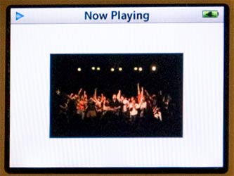
Take a look at this image:

It’s this rather kick-ass shot of the Dismemberment Plan that I’m using as the album art for the recording of a live show. Notice how it’s is in a widescreen ratio? Also notice how it has the same white borders as regular album art, plus some extra thick borders on the top and bottom?
Why does the iPod not scale the image so that I fills up as much of the screen as possible?
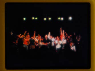
I know the iPod has the ability to do that. Just look at the same jpeg, but using the iPod’s Photo capability:

Full screen and lookin pretty cool. I much prefer it that way. So Apple, when you get a chance, please take care of this little over sight.
Until then, I’ll just had to settle for the thumbnail.

